The Matchmaker Logistics Logo
We put lots of thought and care into the Matchmaker Logistics logo so that it would reflect who we are and what we value. We wanted to share the reasoning behind our choices so that you could also appreciate its meaning:
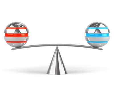 When our founder, Jim Skane, Sr. launched Matchmaker Logistics he chose the fulcrum as our company’s symbol because its function is analogous to our role as transportation brokers. Imagine a lever. It’s the simplest of all machines, yet it is still a tool that makes a difficult job much easier. Levers (think seesaws, shovels, and wheelbarrows) are often used to lift heavy loads. The fulcrum is the pivot point, or an in-between point, that provides tremendous power to its user through increased strength and leverage.
That’s been our mission for the past 30 years. By balancing shipper’s needs with carrier’s capabilities, we help our clients create leverage in their businesses. Our in-depth industry knowledge, outstanding customer service, and strong ethical practices provide our clients with value that saves them wasted time, unnecessary aggravation, and costly miscalculations.
As we have evolved by embracing new technologies and updated legislation, we have also tweaked our logo. Our current logo pays homage to our past (the initial fulcrum concept) with its triangular shape. The equilateral triangle, with three equal sides, symbolizes the importance of all parties in a 3rd party logistics transaction. It is always our goal to create win-win-win situations for shippers, carriers, and broker.
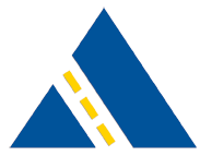 The highway that intersects the equilateral triangle signifies our commitment to the transportation industry, which is the heart of our business. The dotted highway indicates two-way traffic and by extension our unwavering respect for both sides of the industry (clients and carriers). Finally, our blue color scheme conveys the core values of Matchmaker Logistics: stability, unity, and loyalty; in short, a promise to be “true blue”.
We reviewed nearly 200 concepts before selecting the newest version of our logo, and we believe we found the perfect match. Matchmaker is proud to stand behind everything it represents, and we look forward to putting the same thought and care into a meaningful relationship with you.